Role
Lead Product Designer
Medium
Web Application
Collaborators
PM, 3 Frontend Engineers, 8 client stake holders
Stack
Figma, Sequoia, Confluence
Capital One is a major financial institution renowned primarily for its credit card services, bank offerings, and auto loans. It’s one of the largest banks in the United States, known for integrating technology extensively in its operations.
Capital One approached Webstacks to optimize their site experience, enhance user engagement, & drive core KPIs through UX design & web development support. They wanted to achieve this by designing & developing two main components, one of which was a Full Width Video Carousel that supports transcripts.
Capital One already had a full-width video component in their design system, Gravity, but this component wasn’t supporting many of the goals listed above.
For the video component, their team came to us with a few initial ideas of what they wanted this component to solve:
We knew the foundational information about who Capital One’s audience is, and how these components provide value, but we needed more info before we could move further. For example:
As we asked more questions we realized that the Capital One Team wasn’t sure what they were looking for. Questions were often met with “we’ll get back to you” or long discussions were left open-ended in review meetings. This made it difficult to define a strategy to meet our larger goals.
I concluded that their team needed to visualize a variety of concepts to process how they wanted this component to fit into the existing Gravity design system.
I approached our first round of design by producing a higher number of slightly lower fidelity concepts. The intent was to enhance the conversation around complex feature limitations like the amount of content within the component, progress indicators, parsing transcript data, action placement, and even layout. I designed 4 main concepts with 2-3 iterations each, which provided more than enough work to start a discussion.
Image of First design concepts here.


At first, I was nervous about shifting my strategy to be more conceptual and less concrete with our first iterations of work. Then we joined the meeting where I shared my ideas behind each concept and how the iterations emphasize a different approach to user needs. I managed to help clarify a significant amount of their team’s objectives through these concepts which helped us narrow down what their team was looking for as we went into the next round of design iteration! Was every design a perfect solution? No. But that’s the point! From here we adjusted back to our normal strategy and produced 1-2 high-fidelity concepts that include tablet & mobile breakpoints, and a nested variation to be used within articles. The nested variant had a width of 10-columns vs the original 12-columns width, it also had a gray fill which adjusted the container padding of the carousel.
In round 1 I wanted to provide as much value as possible in the mockups with content like:
Some feedback I received was there’s too much going on and we needed to simplify the actions so users could focus more on the content.
One of the biggest issues we needed to solve was how to display the transcript in an accessible way, making it feel connected to the playing video, and with the appropriate amount of emphasis needed. In the first two rounds of concepting, I experiment with two solutions for the transcript button.
The first was to have tabs for the video carousel and the transcript. The video carousel would be selected by default. When the transcript was selected, a container with a height of 400px previewed a small portion of the transcript. At the bottom of the container was a gradient fading out the transcript with a “show more” text link overlayed on top. By clicking the “show more” link users would scroll down to view the whole transcript without expanding the container.
Image of tabs design and transcript.
This solution ultimately created friction by hiding the video carousel from users, making them work harder to access it. Our second solution was only to have a transcript button. When clicked a container with height of a 300px previewed the transcript along with the same gradient & button pattern as the solution above. The video carousel would be pushed down below the transcript. This solution had a few benefits:
Image of the transcript section we end up with along with the show transcript button.
For the transcript content layout, this was a bit trickier. Transcripts can be very long. You can’t predict what type of videos content editors will use. I initially wanted to display the transcript within a fixed container to minimize height shift. The issue with this solution is if the transcript gets cut off in any way, this would damage accessibility.
Image of the transcript section with scroll bar
I also mocked up a concept using a popup modal for the transcript section. This was mostly conceptual and not a strong solution for many reasons. Though popup modals can be accessibility friendly, they require more steps for development & users making things much more complicated. Having the transcript within a popup modal also would not have solved the problem of having a fixed height and content scroll.
Image of the transcript as a popup modal
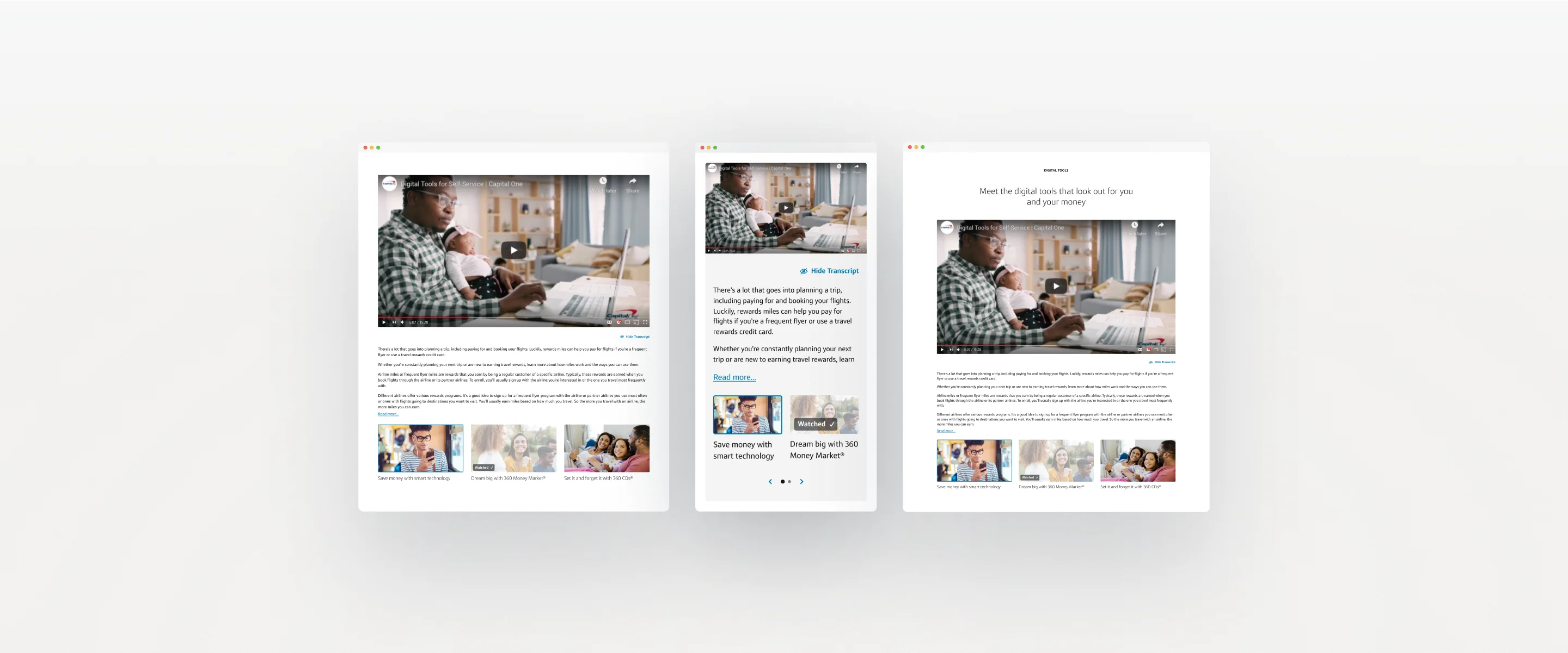
After rounds of iteration, I refined the first transcript solution creating a simpler and cleaner user experience. I removed the gradient overlay behind the “show more” link and replaced the text to “read more”, anchored the link to the bottom left of the container as if it was the start of a new sentence. This made the link easier for users to find as the paragraph would guide their eyes to the text link while smoothly aligning it with the text block as if it were part of the paragraph. When users click the “read more” text link, the transcript will fully open and push down the video carousel and all the page content below the component. If users get to the point of wanting to read more of the transcript, it’s clear their primary objective is to access the transcript in its entirety. Lastly, this helped us remove an unnecessary pattern and stay consistent with the Gravity design system.
Image of final transcript outcome
After many rounds of iteration, we trimmed down the component to its simplest form. At first, the Capital One team wanted the carousel to hold 10 videos max. As we iterate, we decided to limit it to 3 videos. This removed the need for the progress arrows, though on mobile the carousel displays two cards at a time bringing back the need for the progress arrows. We also removed the heading, subheading, CTA, and social links making it easier for users to engage with video content and for content editors to manage the site.
Image of final component on desktop
Image of final component on mobile
The Capital One stakeholders approved the design and we started to work on prepping the tech handoff to development along with component documentation using Confluence. Because this project was so recent we are still collecting user data which I will update this case study with once collected.