Role
Lead Designer
Medium
Web Application
Collaborators
3 Frontend Engineers, 1 Backend Engineer, PM
Stack
Figma, Contenful, Next.js, Vercel Analytics
Presbyterian Healthcare Services (PHS) is a private, not-for-profit health care system in New Mexico. PHS is the state's largest provider of health care. PHS owns and operates nine hospitals in eight counties, a multi-specialty medical group with more than 900 providers, and a statewide health plan.
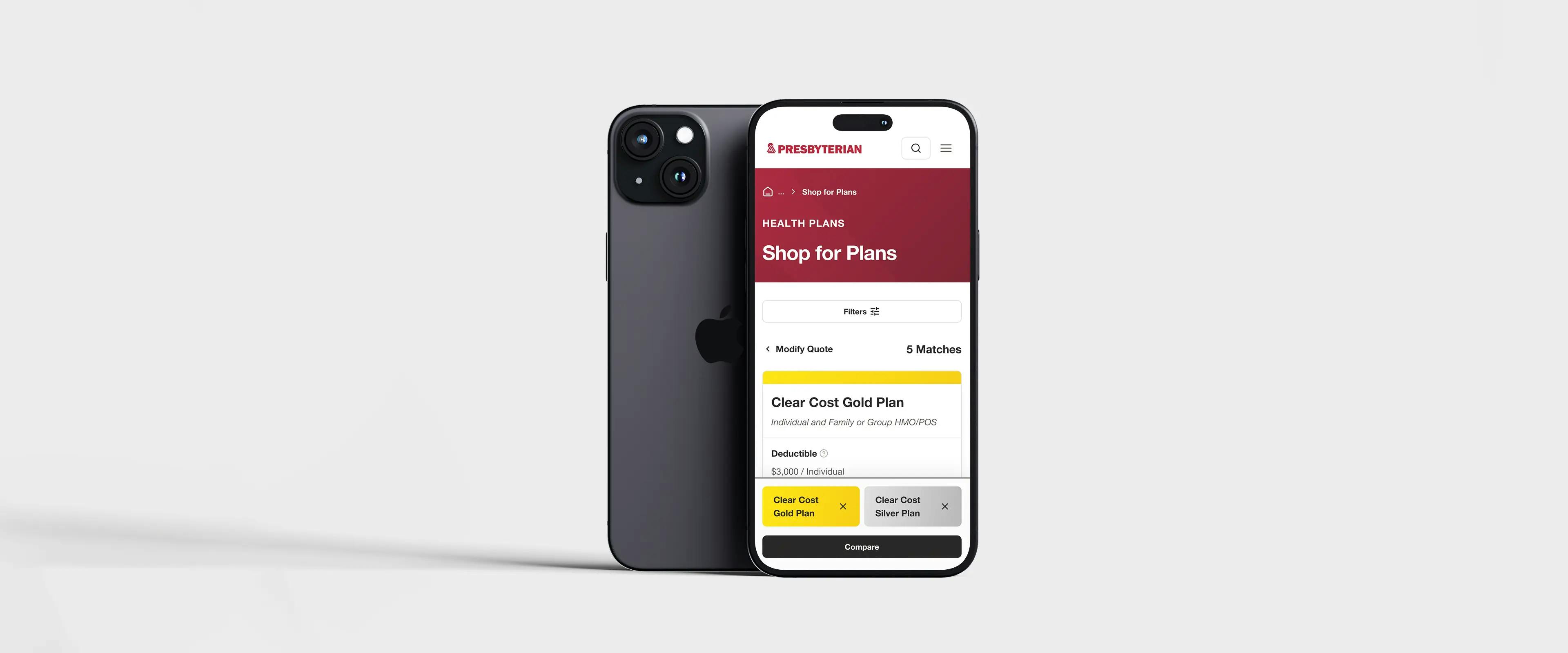
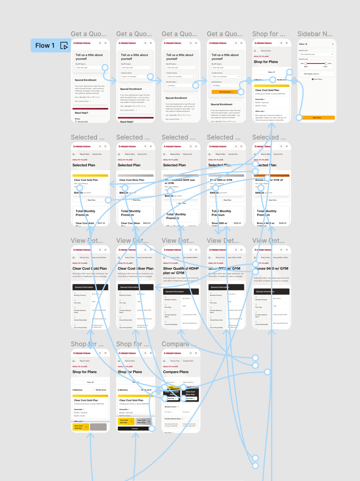
Online Enrollment is as its called, an online enrollment tool that helps users get a quote, quickly compare plans, and enroll in the Presbyterian Off Exchange Individual and Family Plans. This tool is one of the first steps for users to solidify their relationship with PHS.

PHS’s Design System was built based off of the organization's brand assets which we adapted to an atomic model. We break down our contents into 3 sections: Atoms, Molecules, & Components. Atoms are the building blocks that consist of all our user interfaces. Atoms include basic CSS elements like colors, typography, shadows, blurs, grids, icons, and others that can’t be broken down any further without ceasing to be functional. Molecules: Are simple groups of UI elements functioning together as a unit. For example, a button, search field, and label can join together to create a search form molecule. Organisms/Components: Are more elaborate UI components composed of groups of atoms, molecules, and other organisms/components. These organisms form distinct sections of an interface.
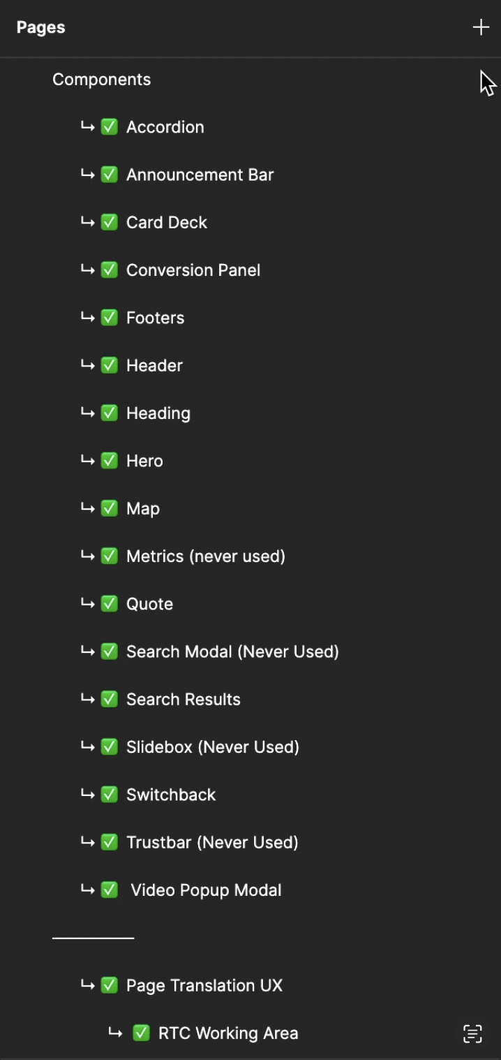
There are many ways to organize your design system in Figma. Each designer or team will have a system that fits their own needs. At Webstacks, we organize our design system into three sections: Atoms, Molecules, & Components. Templates, pages, & tools live in a separate file. This is to keep our work organized, minimize file size, and help our clients & team stay on track as we build content.
Our design system leverages a purposeful set of color styles as the perfect starting point for any brand or project. When it comes to color, contrast is critical for ensuring text is legible. We've added WCAG 2.1 contrast ratios to our color system so you can make sure you're designing with accessibility in mind.

After colors, we build out our type system which leverages a purposeful set of typographic styles. We’ve stress-tested this typographic scale across dozens of projects to make sure it’s robust enough to use across (almost) any project, while remaining as accessible as possible for everyone.

When we build components we have to ask ourselves what is every use case for this component? Would the user like to display a CTA, statistics, or a testimonial? How many tools or pages will use this component? Is this component for long form or short form content? These questions and more are important to ask before any designing has happened.
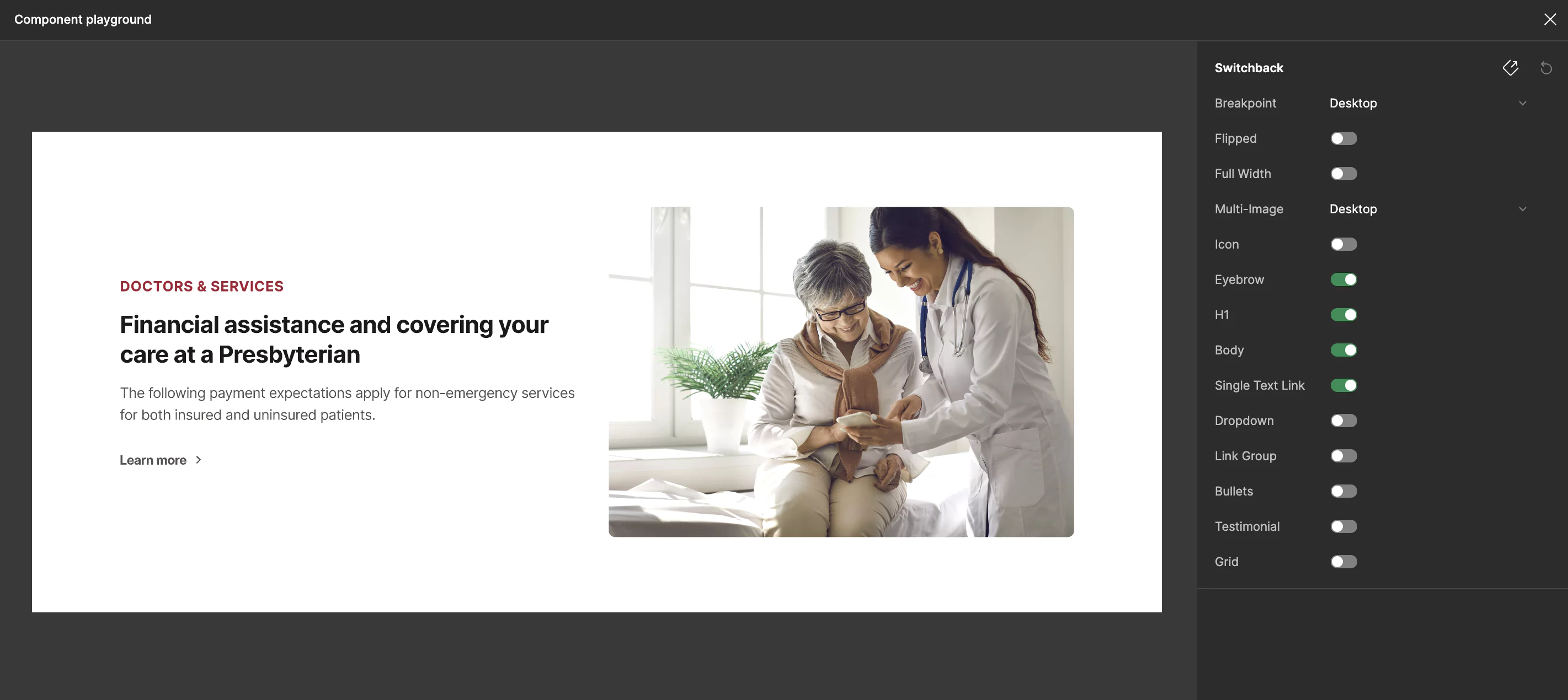
In the case of this switchback example, this component will be used widely throughout hundreds of pages.

We are going to utilize Figma components & variants to build this component. Seen below is the component built in a light & dark mode with variants for desktop, tablet, & mobile. A few key requirements to a well built component are:
When building components, we want to make our lives as easy as possible by utilizing Figma’s features. One of the best features in Figma is the Boolean property. As seen in the video above, we add booleans to every section of the component that we would ever need to alter in the component. This is to make page & tool builds as quick as possible.
One of the biggest UI issues I see from business to business is finding a solution to a mobile-friendly table. Tables are commonly very large sections full of very important content. It can be difficult to ask yourself what information is important to keep and what can I take away? Because of this, most commonly websites & applications will develop unscalable tables that make it extremely difficult to read on smaller devices. PHS was experiencing this issue with users trying to understand which insurance plan was right for them. PHS has over 2 dozen different plans to choose from, and narrowing them down can be difficult. Creating a dynamic table that was scalable to mobile sizes was going to be key to reaching our goals of creating scalable components and helping users identify which plan was best for them.
Our first pass at creating this dynamic table involved a standard table solution we use on desktop: Create a 5-column design that separates each column to clearly define which column the user is looking at as shown below. We found that this was not working for what we needed. The first column acting as the row heading was squishing the content together making content difficult to read and not fitting larger amounts of content well. The amount of space it was taking up was simply not working. When we scaled down to mobile the layout of content changed as well. After syncing with our dev team on our solution, we found that having two different layouts for desktop & mobile would not be efficient.

We knew we needed to align our mobile & desktop solutions and decided to it would be easiest to refine our mobile solution to match desktop. Now I want to preface that I am aware of the age-old debate between designing mobile first vs desktop first. I personally lean towards creating a desktop-first perspective over mobile first. Reason being, desktop is still the #1 way users view content on the web. Because of this, we should be building our designs first for our #1 demographic and adapting our designs for our #2 demographic second. Restaurants don’t build their menus around vegans if they serve meat, they adapt their menus to accommodate their secondary demographic. In this instance, scaling our mobile solution to work on desktop was the best solution for creating a scalable & dev-friendly dynamic table. When building our dynamic table in Figma, I componentized each level of the table to make it dynamic & adaptable. I started by building the table rows component to hold 1 through 5 components.

From here I built out the Plans Table Component. This makes up the larger structure table structure making the table easier to toggle between number of columns.

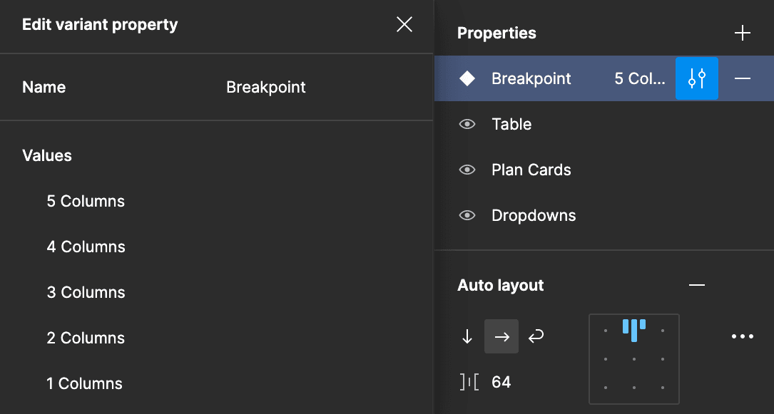
Lastly the Comparison Table Component is built out. At this stage I will normally add a breakpoint property for Desktop, Tablet, & Mobile. In this instance, it made more sense to define variants by a column property.

As stated above, it can be tough to know what information seems vital when comparing plans. On desktop, we are able to compare 4 plans at a time meaning 4 columns of content are important information. Would I rather the user be able to compare 4 plans at a time and risk the content being difficult to navigate and read? Or would I rather the user be able to navigate less plans for a better experience. I chose the latter. Comparing 2 plans at a time created a lets the content sit comfortably side by side in the dynamic table so users are able to scan & process information without having to scroll horizontally and vertically to view the information. With the Sticky heading at the top of the site, the user will always be able to see what plan they are looking at as well.
Now with removing 2 plans from view on mobile, we needed to think of a way users would easily be able to view other plans in case they decided one of the plans they were looking at was not for them. We had a few options of how we could solve this issue.


It's easy to think that a solution that fit for past work will fit for future work. That's not always the case. This assumption produces inconsiderate designs and a poor product.
It’s never too early to loop the dev team into your ideas. They are like the traffic controllers to the design phase. They can let you know when you’re off route and when you’re in a crash collision course. Trust them and help them help you make the best product possible.